What is a mood board?
A mood board is one page that fixes how a project will look and feel before anyone buys anything: the color palette, the materials, a few key pieces and the quality of light. In interior design it is the document a client approves before samples and orders, so it has to be specific enough to act on, not just pretty.
Designers use a few related boards, and it helps to know which one you are making:
- Mood board: the overall feeling, built from photos, colors and textures. It answers "what should this room feel like?"
- Material board: the actual finishes, ideally physical samples of flooring, paint, stone, fabric and metal. It answers "what is it made of?"
- Product board: the specific furniture and lighting, with brands and prices. It answers "what do we buy?"
The method below starts with the feeling and ends with all three boards, which is how most residential projects actually run. AI helps at two points: turning a room photo you already love into a first draft, and rendering the finished board as a room so you can check it before you order.
Before you start: write a one-line brief
Open a note, not Pinterest. Write one sentence about who uses the room and how, then list what cannot change. For example: "A quiet living room for two adults who read in the evening; keep the oak floor and the north-facing windows; mid-range budget."
Add three words for the feeling (calm, warm, tactile) and one word you want to avoid (cold, busy, precious). Every image you add later has to agree with this sentence. If it doesn't, it goes, however good it looks.
Step 1: Collect wide
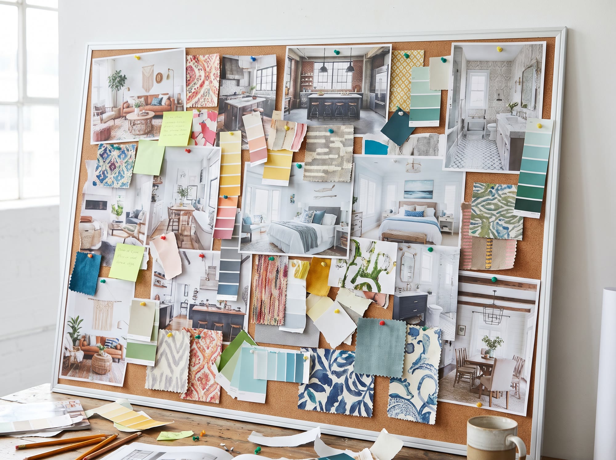
Gather 30 to 50 references without judging them yet. Mix sources: photos of rooms you have stood in, magazine pages, product sites, your own phone pictures of a hotel lobby or a stone wall. Pinterest is fine for collecting, but it pulls everyone toward the same few hundred images.
Collect close-ups as well as whole rooms. A wide shot shows proportion and light; a close-up of a linen weave or a honed stone edge shows the texture you are actually choosing. Under each saved image, write a few words on why you kept it: "the low sofa back", "warm gray walls in shade". Those notes matter more than the pictures in the next step.
Step 2: Cut to 10 to 15 references
Now edit. Each image that stays has to carry one decision the others don't: the wall color, the floor tone, the shape of the sofa, the type of lamp. If two images make the same point, keep the clearer one. If an image only says "nice room", it goes.
Most people stop at 25 and wonder why the board feels noisy. Ten to fifteen is enough for a single room. A quick test: show the board to someone for ten seconds, take it away and ask them to describe the room in one sentence. If their sentence matches your brief, the edit is done.
Step 3: Pull a palette from the references
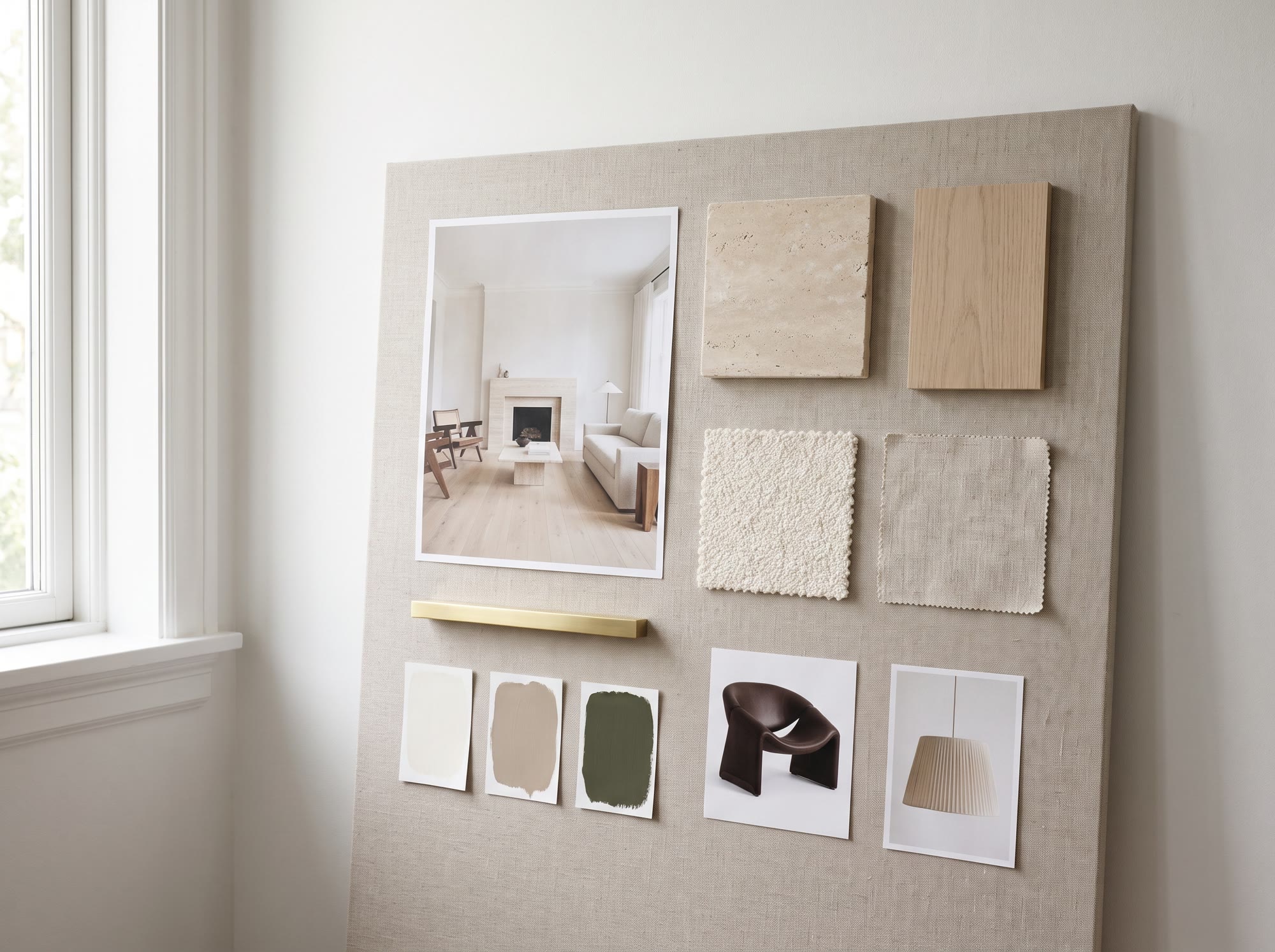
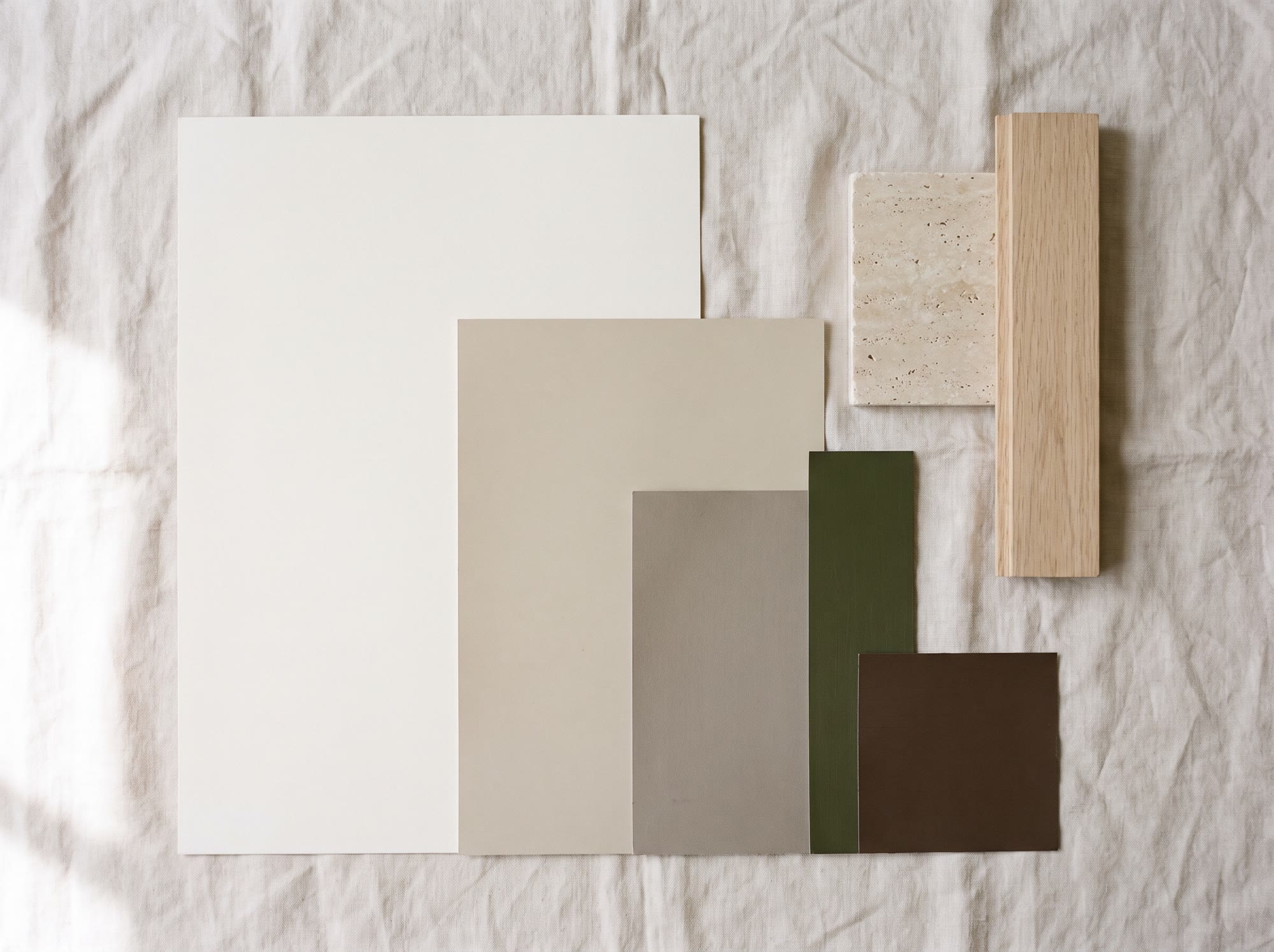
Pick three to five colors straight from the images you kept rather than from a paint fan, so the palette and the pictures agree. A useful starting split is roughly 60/30/10: a dominant base for walls and large surfaces, a secondary color for upholstery or joinery, and a small accent you could remove without the room falling apart.
Include the colors you already own. A floor, a kitchen front or a sofa that stays is part of the palette whether you like it or not. Show colors at the size they will appear: the wall color as a large field, the accent as a small chip. Equal squares make every color look equally important, and they never are.
If you start from a room photo you love, an AI mood board generator can do the first pass. Scene to Moodboard on Lovspark reads a room photo and lays out its palette, materials and furniture as a board, which you then edit like any other.
Step 4: Add real materials and check them in your light
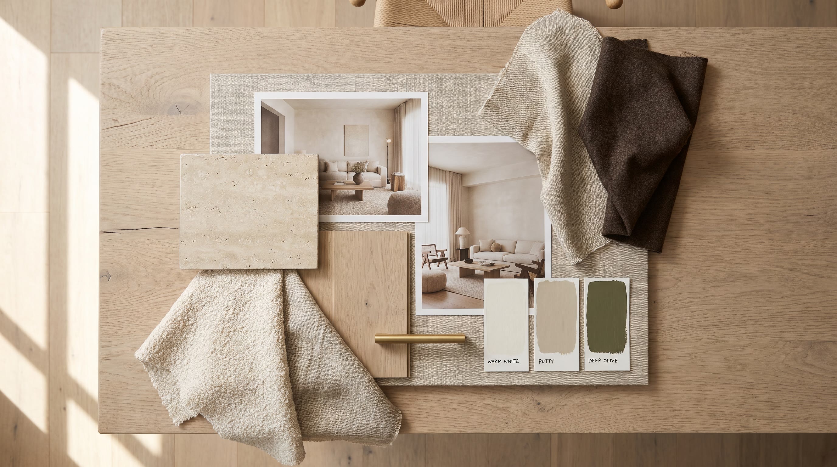
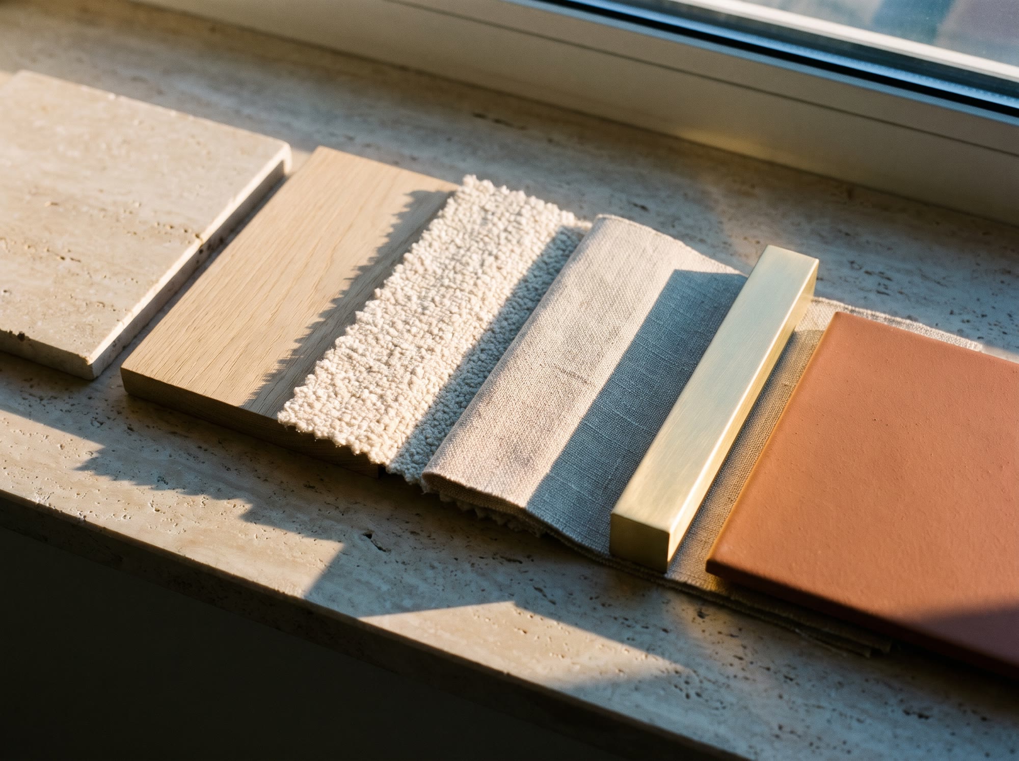
Colors are a starting point; materials are what the client touches. Add the finishes for each big surface: flooring, walls, worktops or stone, the main fabrics, and one metal for hardware and lighting. Order physical samples as soon as you can. A screen shows an idea of oak; a sample shows its actual grain, sheen and undertone.
Look at samples in the room, at the times it is used. North light cools and grays everything; low western sun pushes warm colors toward orange. A warm white that looks right in a showroom can turn flat or yellow at home. Contrast matters as much as color: put matte next to a little gloss, rough next to smooth, so the room does not read as one beige surface. If samples are slow to arrive, an AI render of the board in the room's real light is a fair stand-in until they do.
Step 5: Choose an anchor piece, then real products
Start with the largest or most expensive item, usually the sofa, bed, dining table or a rug, and build around it. It sets scale and most of the color, and it is the hardest piece to swap later.
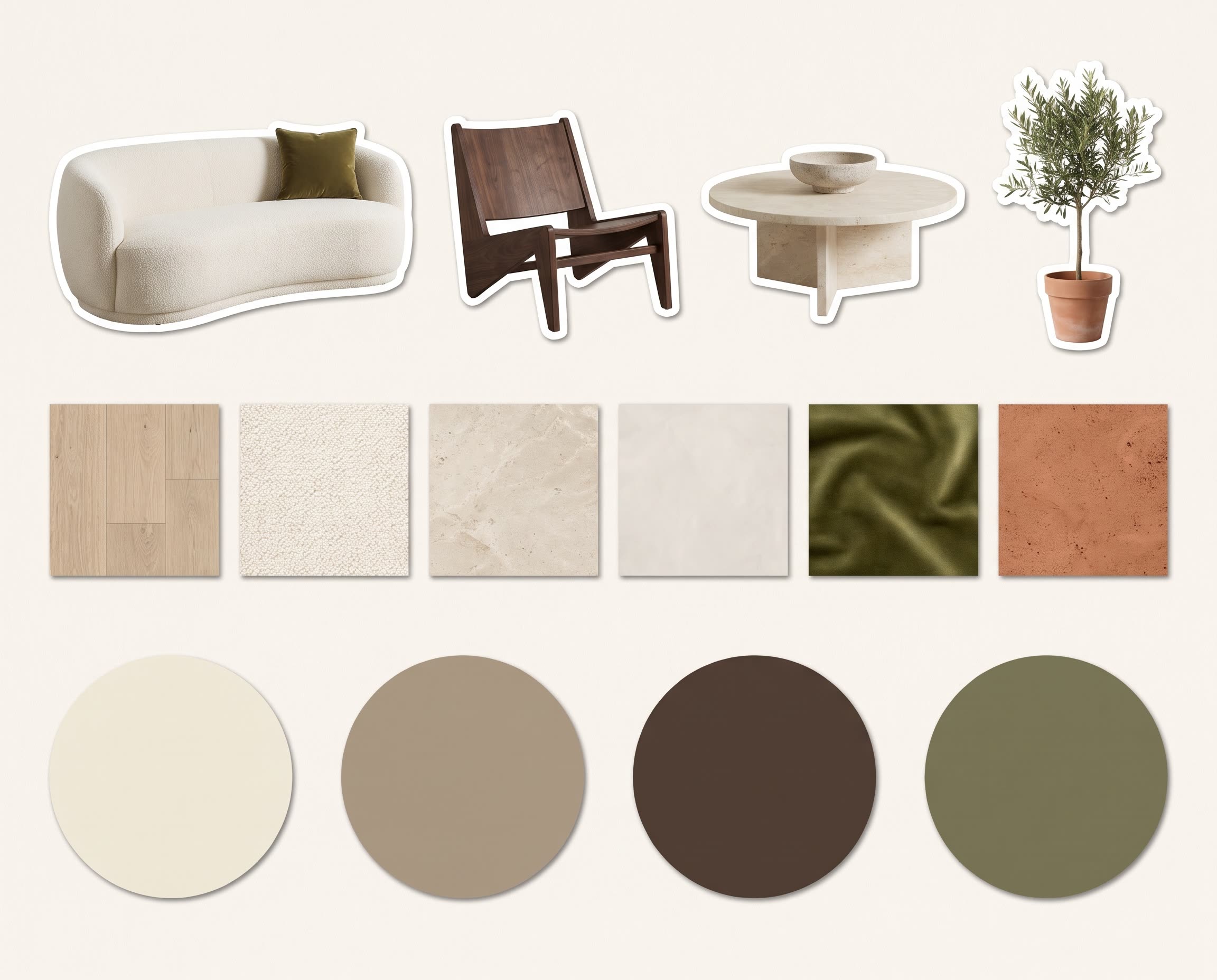
Then add pieces that actually exist, with a brand, dimensions, price and a link. A board of products you can buy turns into a shopping list; a board of "something like this" turns into weeks of searching and a room that does not match what the client approved. Use product shots on a plain white background, or remove the backgrounds, so the pieces sit together instead of each bringing a different room along.
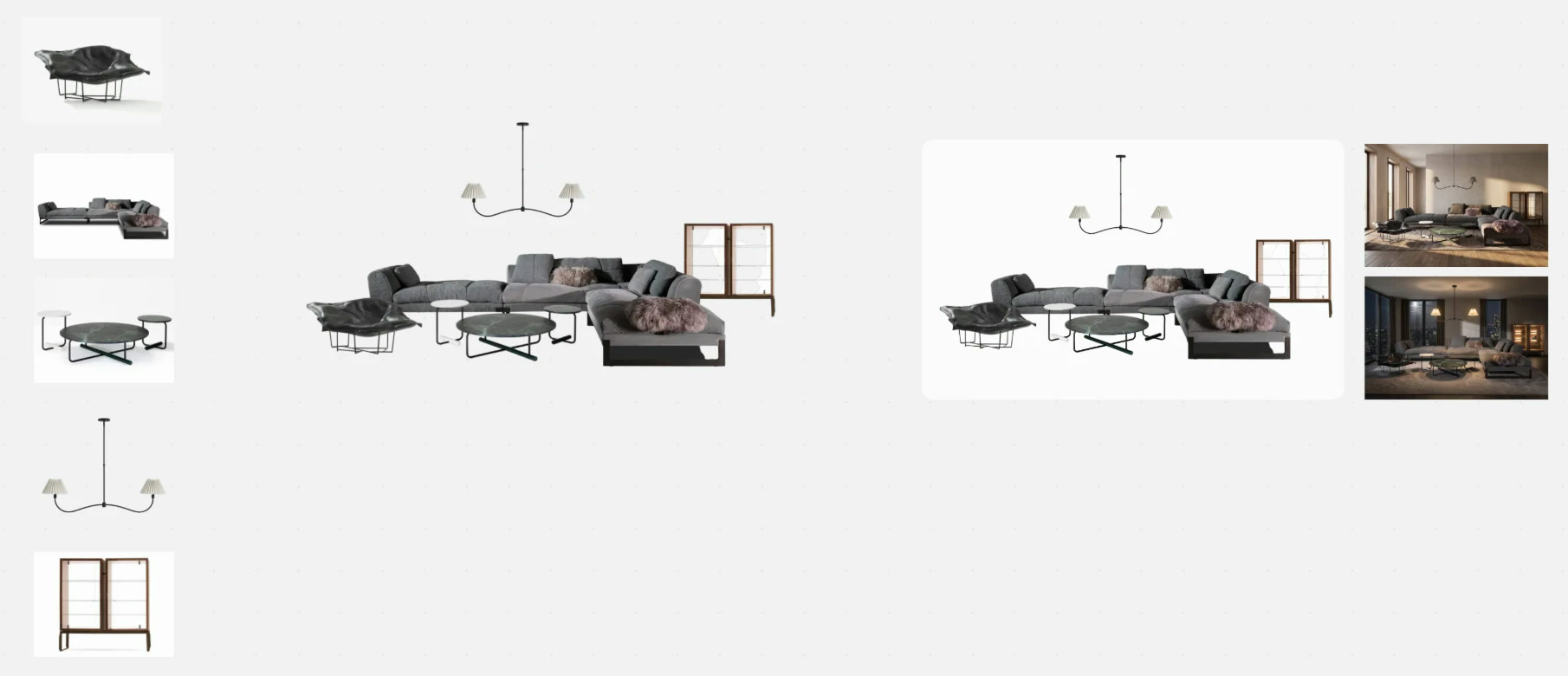
In the Lovspark canvas this slow part gets quick: pick pieces from the product library, which keeps brand, model and purchase link, drop in your own photos, and remove backgrounds with one-click AI cutout, which keeps edges clean enough to set a sofa on a rug without a halo.
Step 6: Lay out the board
Arrange by importance, not by grid. Put the anchor piece largest, near the center. Put the floor, rug and wall color behind everything else, the way they sit in the room, so furniture reads on top of them. Group things that live together, such as the sofa with its side table and lamp, and leave white space between groups.
Label every item: what it is, the finish, and where it goes. Unlabeled boards get misread, especially once they are forwarded to a contractor. A landscape format, 16:9 for screens or A3 for print, fits a single room. For a whole house, make one board for the shared palette and one per room. The same layout feeds the AI render in step 7, so place pieces at roughly the scale they will have in the room.
Step 7: Test the board as a room
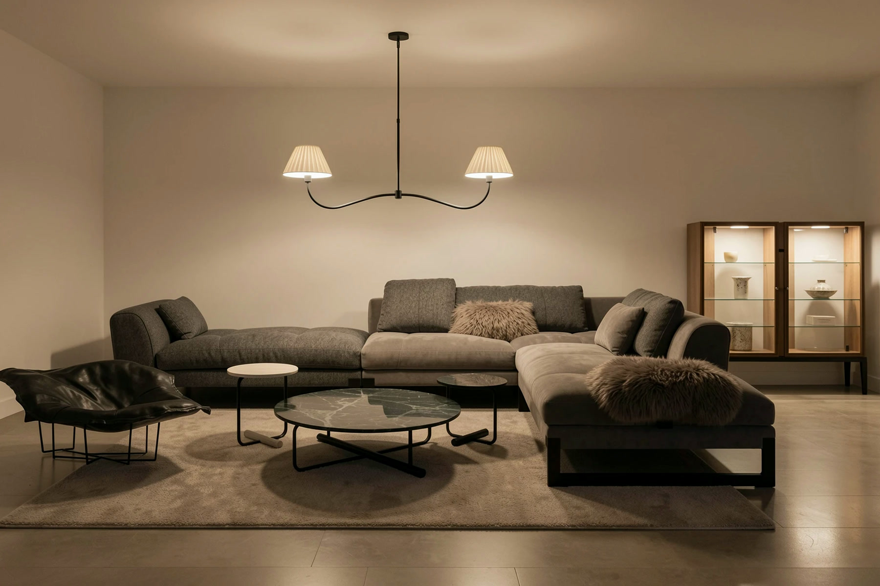
A board can look balanced as a collage and still fail as a room: a rug that disappears against the floor, a sofa that overpowers a small space, a palette that turns muddy at night. Before you order, see the board in perspective.
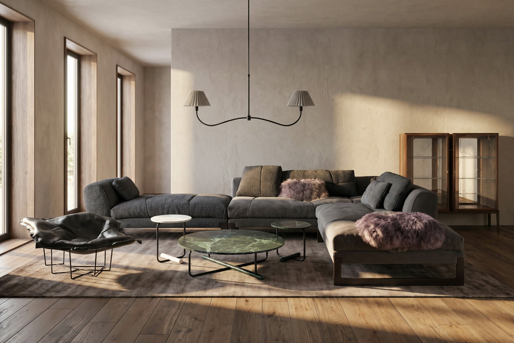
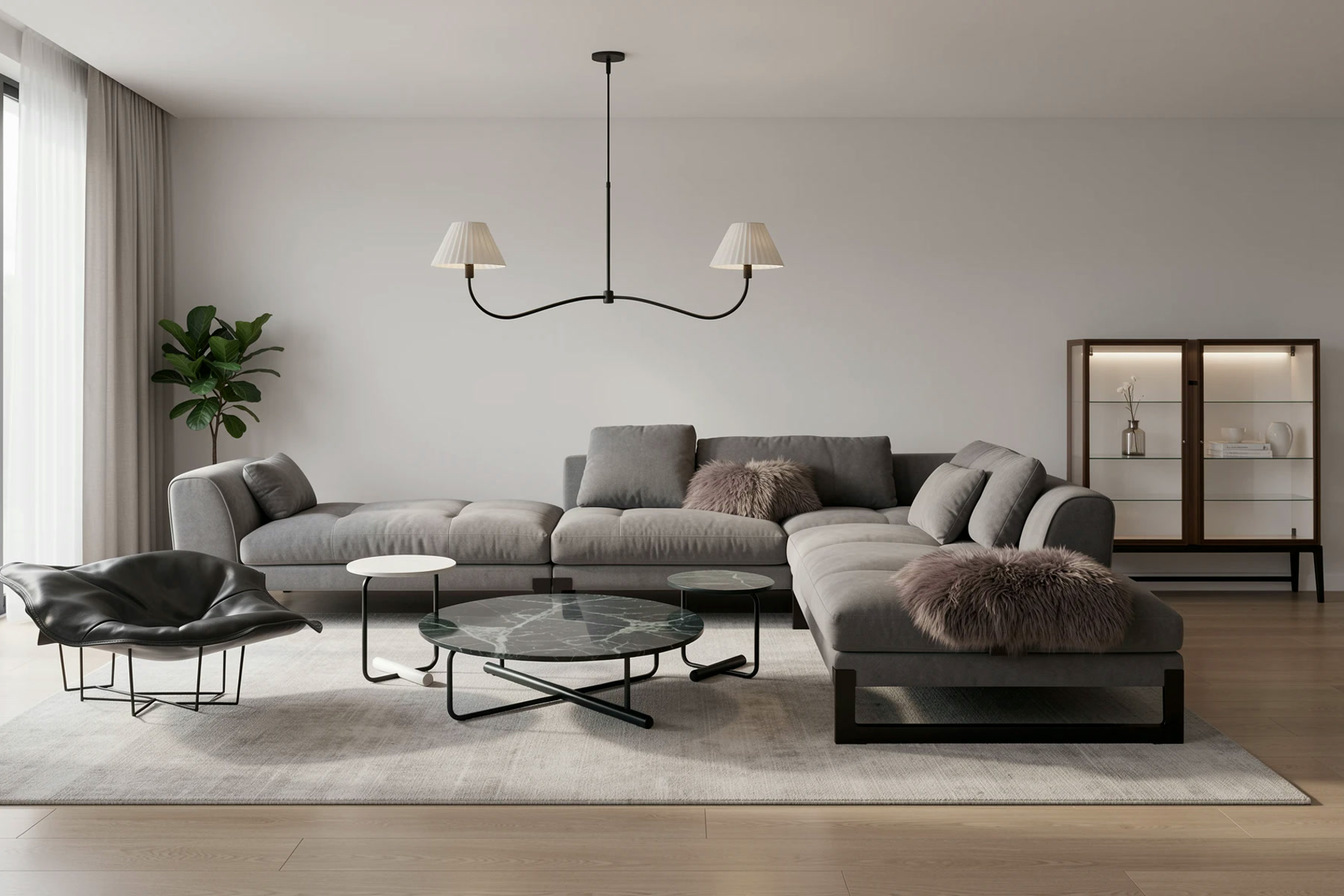
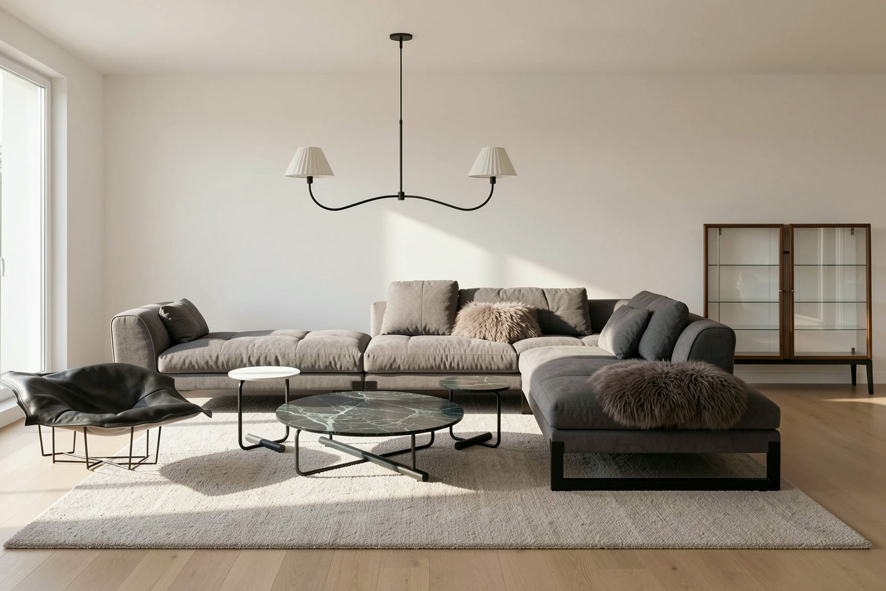
Moodboard to Render on Lovspark does this from the white-background collage: AI places the pieces in a room with their colors and proportions kept, and you can render the same board in low sun, overcast daylight, midday and lamplight. Put the four AI renders side by side; if one of them looks wrong, fix the board, not the render.
Turn the board into a product list
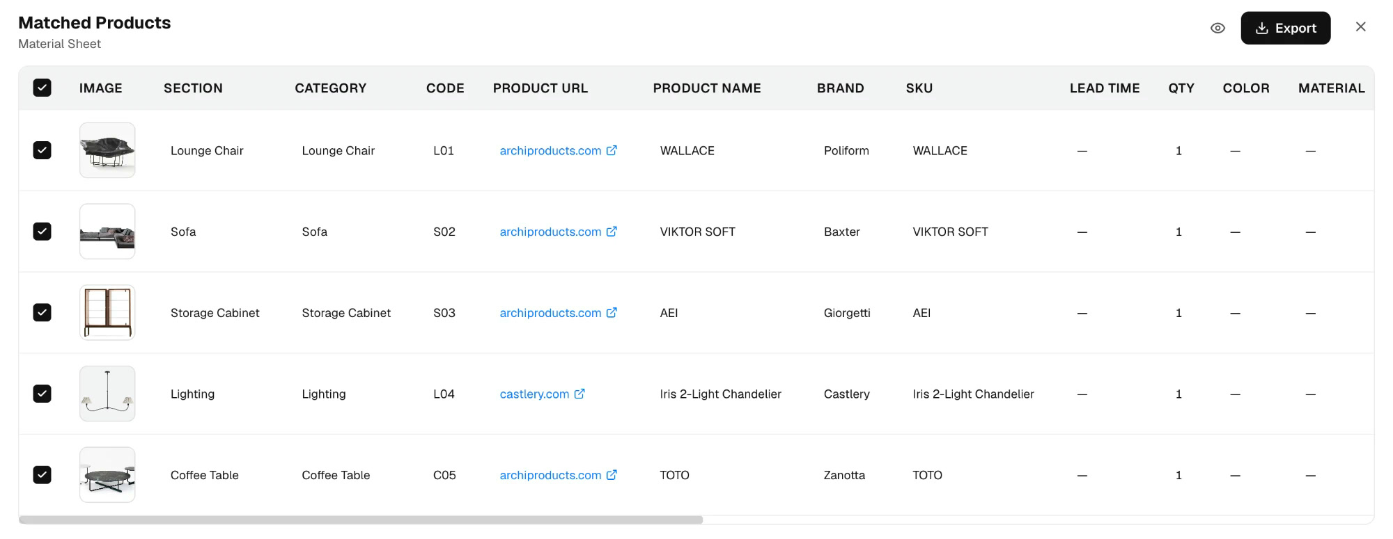
The last step is the one most guides skip. A finished interior board should hand off directly to purchasing: item, brand, product name, SKU, link, quantity and lead time in one table. On Lovspark the products you placed on the canvas export as a material sheet in Excel or PDF, so the board the client approved, the AI render they saw and the list the buyer orders from are the same set of items.
Which tool should you use?
Each option fits a different stage of the work:
- Paper and pins: best for physical samples and a client meeting around a table. Slow to change and hard to share.
- Pinterest: good for collecting in step 1. Weak for editing and layout, and it holds no prices or product data.
- General design apps such as Canva: easy templates for layout. You still source and cut out every product by hand, and nothing checks the board as a room.
- Lovspark: built for interior boards that end in a purchase, with real products and links, AI cutouts, AI renders of the board and an exported product list in one canvas.
Common mistakes
- Too many images. Past fifteen, the board stops making decisions.
- Only whole-room photos. Without close-ups, nobody can tell which texture you mean.
- Choosing colors on screen. Check them on samples, in the room, at the hours it is used.
- Products nobody can buy. Placeholders turn into a second round of sourcing and redesign.
- Skipping the test. An AI render takes minutes; a sofa that is wrong for the room takes weeks to return.
- No labels. Everyone who opens the board reads it differently.
Try it on Lovspark with your own room: start from a photo with the AI mood board generator, or build the board from real products and test it with Moodboard to Render.
Frequently asked questions
What is a mood board?
It is a single page of images, colors, materials and pieces that fixes the look and feel of a project before money is spent. In interior design it is what the client approves before samples and orders.
How many images should a mood board have?
For one room, 10 to 15 after editing. Collect 30 to 50 first, then keep only the images that each carry a separate decision.
What is the difference between a mood board and a material board?
The first sets the feeling with photos, colors and textures. The second shows the actual finishes, ideally as physical samples, so a contractor can price and order them.
Can AI make a mood board for me?
AI can do two useful parts: turn a room photo into a draft board with its palette and materials, and render a finished board as a room in different light. On Lovspark both run on the same canvas. Deciding what fits the brief is still your job.
What size should a mood board be?
Landscape works best for one room: 16:9 for a screen presentation, A3 for print. For a whole home, make one shared palette board plus one board per room.
How do I build a board from real products?
Start from products with a brand, dimensions and a purchase link, cut them out onto a white background and arrange them around one anchor piece. On Lovspark the board then exports as an Excel or PDF product list.