
What is Scene to Moodboard?
Direct answerExtract palette structure and emotional tone so teams can discuss color with shared language.
Lovspark Scene to Moodboard makes color conversations more concrete.
Use it for hospitality branding, residential palette locks, and competitive reference studies.
It pairs well with material analysis by focusing on hue relationships and emotional temperature.
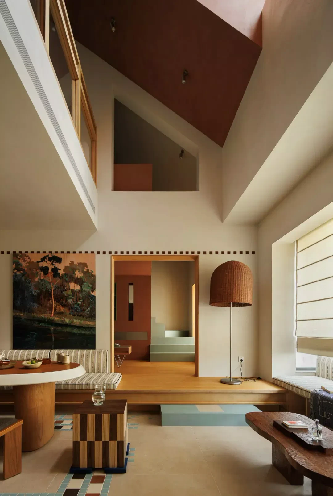
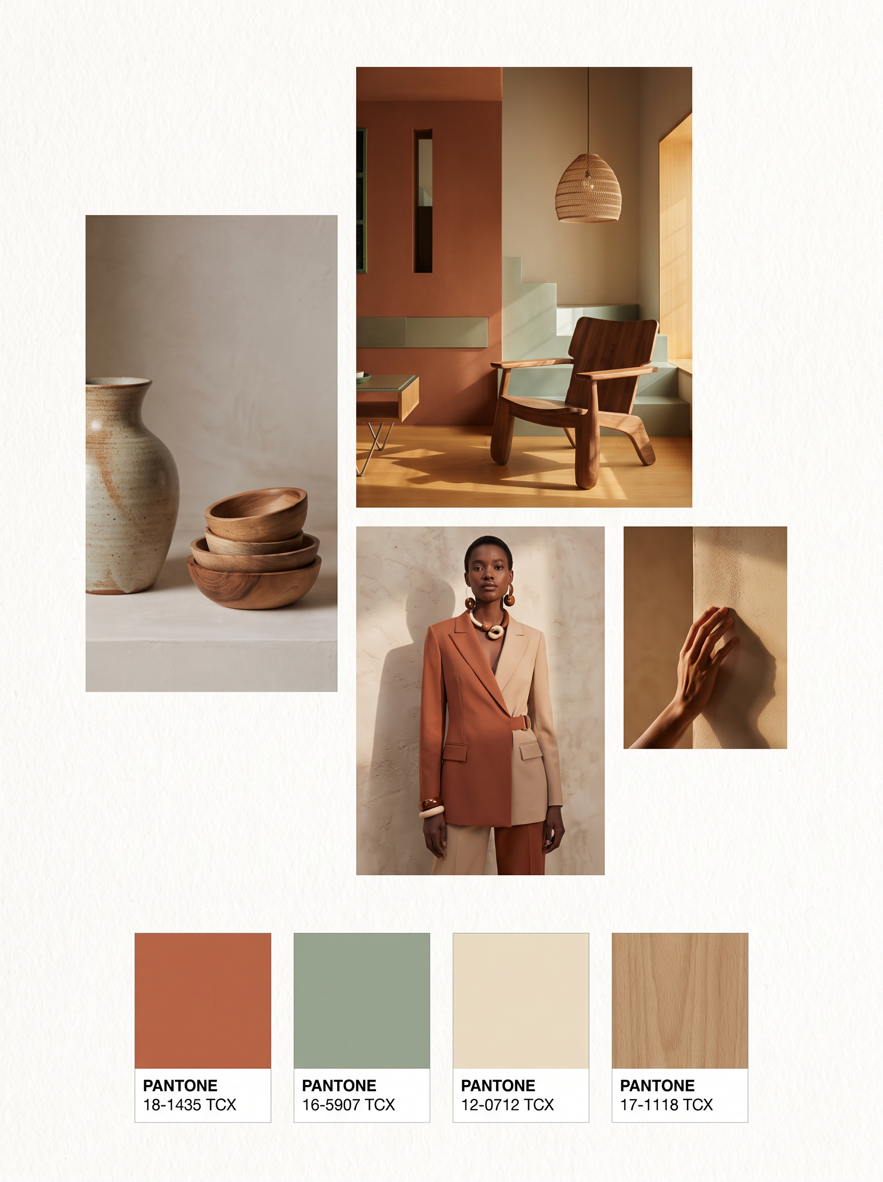
| Input | 1 interior space image |
|---|---|
| Output | Palette / mood analysis visualization |
| Focus | Hue relationships and emotion |
| Best for | Mood boards, brand-adjacent interiors |
| Also useful with | Ambience Shift / Material Extraction Analysis |
- Complete interior space images
- Spaces with visible colors and materials
- Interior images for palette direction
Updated by the Lovspark Product Team, based on the live product and real project examples.
Sources: Lovspark product documentation · Lovspark Academy
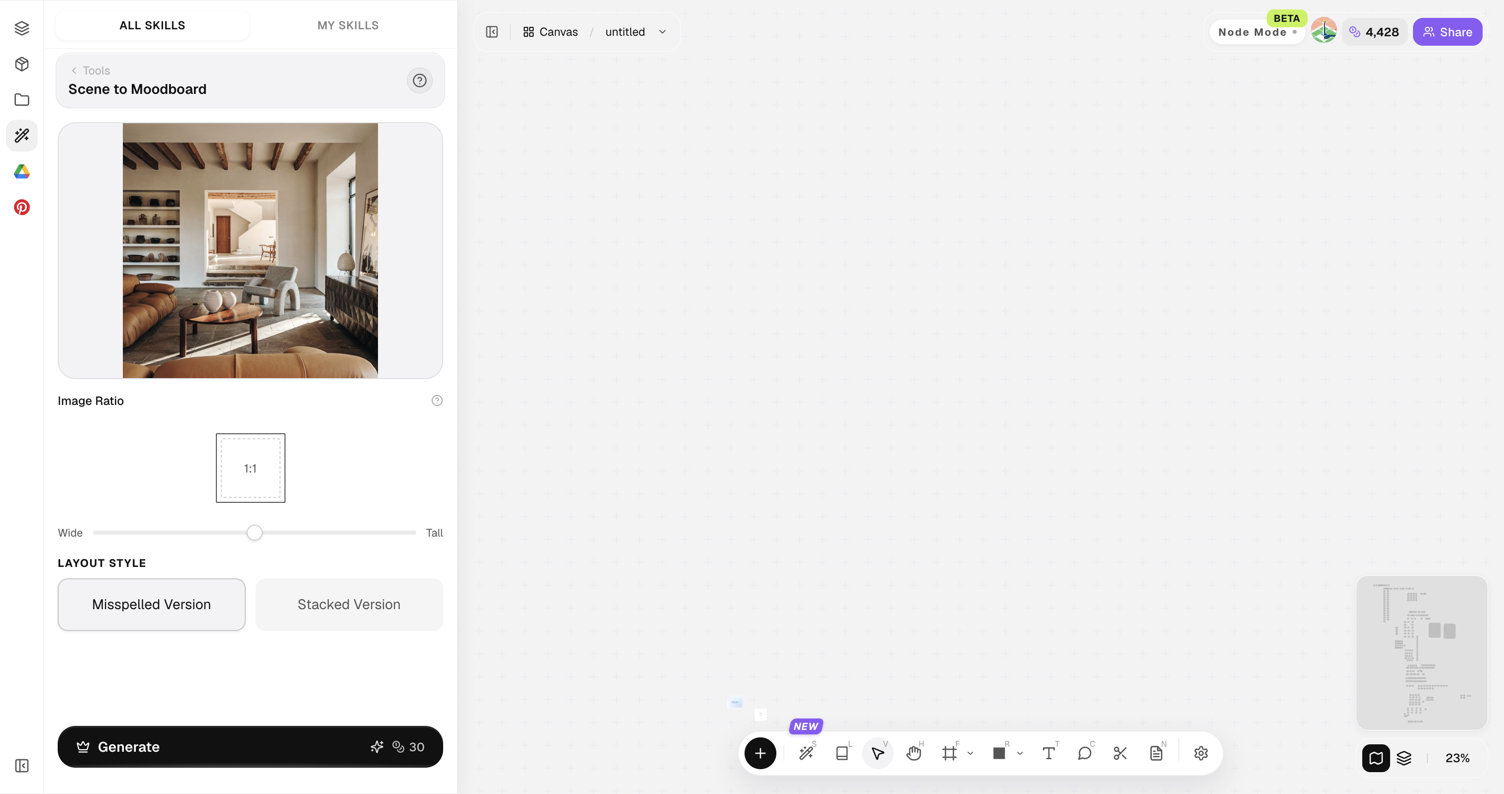
Scene to Moodboard feature panel
Open Skills library and choose Scene to Moodboard. Upload a space image, set the image ratio and staggered or stacked layout, then generate a mood-and-color analysis board.
Avoid crushed blacks or overexposed whites if you need accurate palette reads.
How to use Scene to Moodboard
Three steps from a space image to palette language.
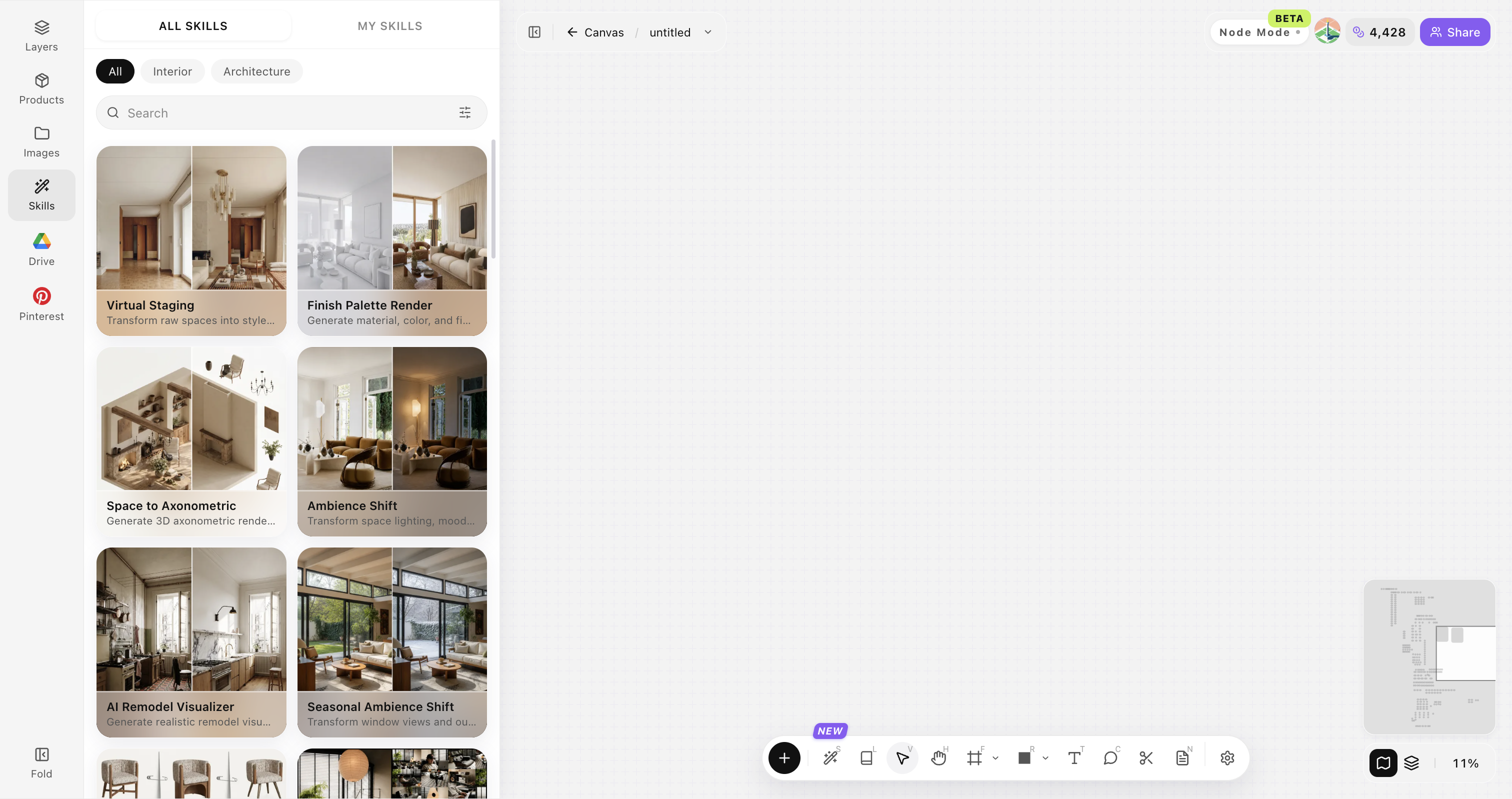
Open Skills library and choose Scene to Moodboard
Open Skills library, then choose Scene to Moodboard from the skill list to start this workflow.
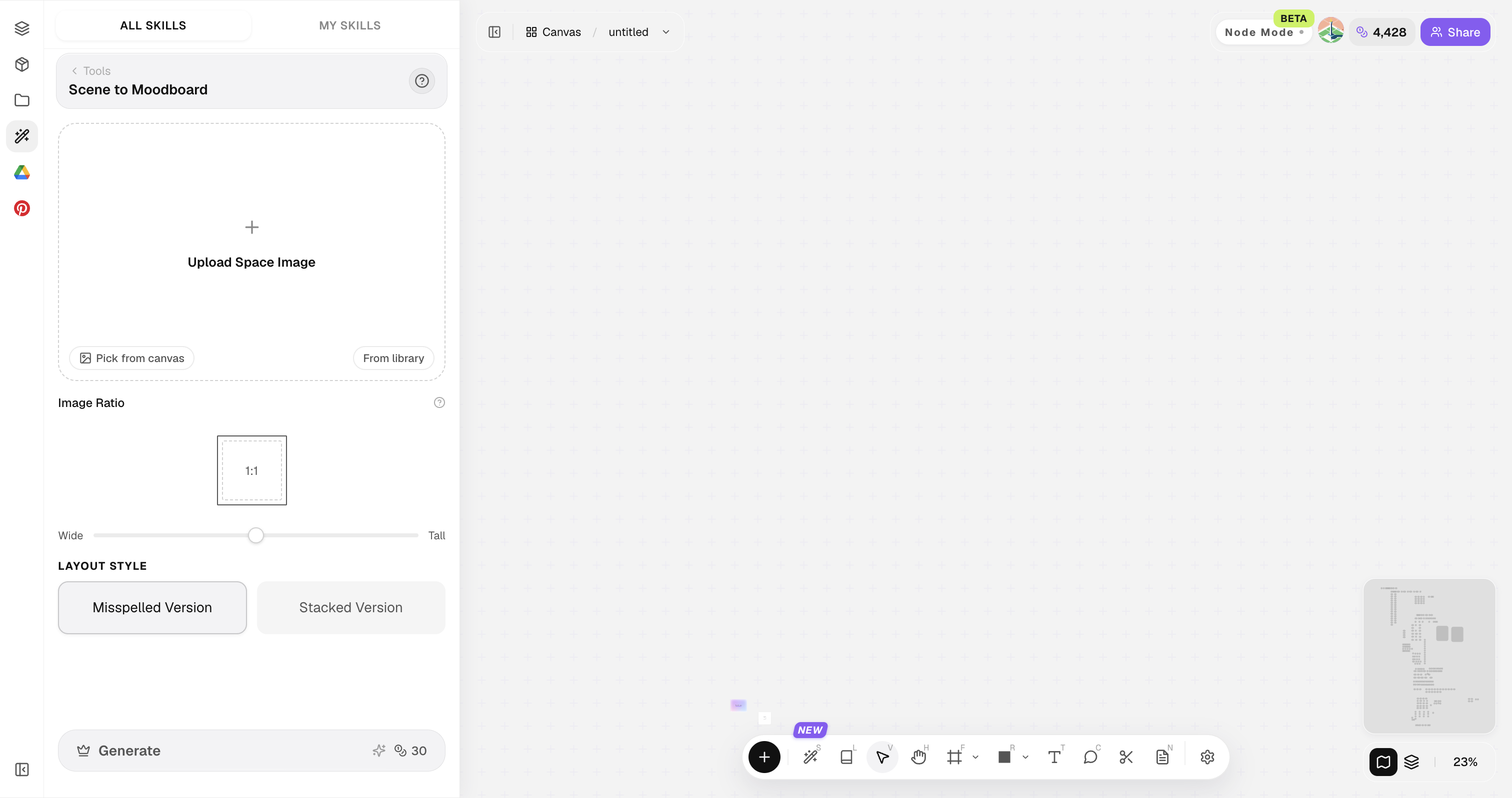
Upload your original image
Upload, paste, or drag in a clear original image. It becomes the base for this generation.
Generate the mood map
Create a palette and emotion-oriented analysis view.
Choose a useful space image
Use one complete, clear space image with readable color and material relationships.
Show the whole space
Include the main walls, floor, furniture and light in one view.
Keep colors and materials visible
Make the main colors, finishes and soft furnishings easy to identify.
Use normal white balance
Avoid strong color casts, filters and heavy retouching.
Avoid obstructions
Keep people, text, watermarks and large clutter out of the frame.
Use a clear original
Avoid blurry, low-resolution or heavily compressed images.
Scene to Moodboard FAQ
Great for alignment — when brand color is critical, still check physical samples.
What is Scene to Moodboard?
Scene to Moodboard reads palette structure and emotional tone from an image, making subjective color conversations more concrete for boards and reviews.
Does it output HEX codes only?
It provides a visual mood and palette reading. If you need exact HEX or brand values, verify with sampling tools and physical references.
Can it guide night ambience?
Yes—use the read as input for Ambience Shift.
Works for product images?
Yes for lifestyle and packaging-adjacent scenes.
Is it for branding teams?
Useful for interiors that must align with brand temperature.